Introduction
What is Prosper
Prosper, or Prosper Marketplace, is a leader in the online peer-to-peer lending industry. Borrowers create profiles and listings (request loans) on Prosper.com investors either individuals or institutions, view the listing (borrower’s loan request) and decide how much to lend the borrower towards the loan.
Interest rates are typically lower for the borrower than going to a financial institution, such as a bank. And multiple investors can contribute to one borrower’s loan request, limiting the overall risk impact of the borrower defaulting on the loan for any one investor and providing a higher yield.
Why Prosper Loan Data
I’ve personally never used peer-to-peer lending, as a borrower or investor, but I find the idea quite intriguing from a borrower and an investor standpoint. Lower interest rates and the ability to get a loan for “small” items is the obvious pro for borrowers. But for an investor, portfolio diversification, higher returns or a less risky investment only holds true if borrower’s don’t default on their loans. So what are the deliquincy rates? Are there any main contributing factors? Is there any coorelation between where someone lives, their income, the purpose of their loan and defaulting on their loan? Delinquencies and feature coorelation at Prosper.com is what I’ll be exploring this EDA of Prosper Loan data.
Delinquent is the failure to accomplish what is required by law or duty, such as the failure to make a required payment or to perform a certain action.
The term delinquent commonly refers to a situation where a borrower is late or overdue on a payment, such as income taxes, a mortgage, automobile loan or credit card account.
Data Overview
The Prosper loan dataset was provided by Udacity as part of their Data Set Options for the Data Analyst Nanodegee.
From Udacity:
This data set contains 113,937 loans with 81 variables on each loan, including loan amount, borrower rate (or interest rate), current loan status, borrower income, borrower employment status, borrower credit history, and the latest payment information.
Dataset was last updated 03/11/2014
Process
The exploratory data analysis of Prosper data will follow a general 4 step process. This process will aim to walk through the entire thought process of analysis to final plots and reflection.
- Overview of the data
- Analysis
- Univariate analysis and plots
- Bivariate analysis and plots
- Multivariate analysis and plots
- Final plots and summary
- Reflection
With 81 variables, it would be useful to indicate which ones you’ll send time looking at. Performed an initial review of all variables definitions and determined a list of 15-ish variables which will be required either directly or indirectly for the exploration.
Main Features of Interest
After reviewing the long list of variables, and thinking of all of the different paths of investigation, I’ve decided to narrow my focus of investigation around deliquencies and their correlations. To this end, the main features of interest are:
- Term: The length of the loan expressed in months.
- LoanStatus: The current status of the loan.
- Cancelled
- Chargedoff
- Completed
- Current
- Defaulted
- FinalPaymentInProgress
- PastDue (the PastDue status will be accompanied by a delinquency bucket)
- BorrowerState: The two letter abbreviation of the state of the address of the borrower at the time the Listing was created.
- ListingCategory: The category of the listing that the borrower selected when posting their listing.
- 0 - Not Available
- 1 - Debt Consolidation
- 2 - Home Improvement
- 3 - Business
- 4 - Personal Loan
- 5 - Student Use
- 6 - Auto
- 7- Other
- 8 - Baby&Adoption
- 9 - Boat
- 10 - Cosmetic Procedure
- 11 - Engagement Ring
- 12 - Green Loans
- 13 - Household Expenses
- 14 - Large Purchases
- 15 - Medical/Dental
- 16 - Motorcycle
- 17 - RV
- 18 - Taxes
- 19 - Vacation
- 20 - Wedding Loans
- CreditScoreRangeLower: The lower value representing the range of the borrower’s credit score as provided by a consumer credit rating agency.
- CreditScoreRangeUpper: The upper value representing the range of the borrower’s credit score as provided by a consumer credit rating agency.
- BankcardUtilization: The percentage of available revolving credit that is utilized at the time the credit profile was pulled.
- IncomeRange: The income range of the borrower at the time the listing was created.
- LoanOriginalAmount: The origination amount of the loan.
- Investors: The number of investors that funded the loan.
Supporting Features
Below are a list of supporting features. These features will not be the source of my main investigation but will certainly help to contribute to deeper dives and identification of possible trends.
- ListingCreationDate: The date the listing was created.
- Occupation: The Occupation selected by the Borrower at the time they created the listing.
- IsBorrowerHomeowner: A Borrower will be classified as a homeowner if they have a mortgage on their credit profile or provide documentation confirming they are a homeowner.
- BorrowerAPR: The Borrower’s Annual Percentage Rate (APR) for the loan.
- BorrowerRate: The Borrower’s interest rate for this loan.
- Recommendations: Number of recommendations the borrower had at the time the listing was created.
- TotalProsperLoans: Number of Prosper loans the borrower at the time they created this listing. This value will be null if the borrower had no prior loans.
- DebtToIncomeRatio: The debt to income ratio of the borrower at the time the credit profile was pulled.
- StatedMonthlyIncome: The monthly income the borrower stated at the time the listing was created.
Exploratory Analysis
Univariate analysis
First, I want to review some basics values and descriptive statistics of the dataset. This is for two main reasons, 1) to verify some values put forward by Udacity, such as the 81 variables and 113,937 observations. And 2) to determine if there is anything “weird” or “stands out” about the data which I may want to dive deeper into. Although I have a general direction, i.e delinquencies and their correlations, if something interesting pops up from the descriptive stats, I’ll take a peek in that direction as well.
Lets take a look at the dataset and verify the dimensions
[1] 113937 81
Now I setup the new dataframe by keeping only the main and support variables.
Column “ListingCategory” is actually labelled “ListingCategory..numeric.” as its column type (numeric) is mapped to a string of one word descriptions/categories.
[1] "ListingCategory..numeric."
'data.frame':	113937 obs. of  19 variables:
 $ Term                     : int  36 36 36 36 36 60 36 36 36 36 ...
 $ LoanStatus               : Factor w/ 12 levels "Cancelled","Chargedoff",..: 3 4 3 4 4 4 4 4 4 4 ...
 $ BorrowerState            : Factor w/ 52 levels "","AK","AL","AR",..: 7 7 12 12 25 34 18 6 16 16 ...
 $ ListingCategory..numeric.: int  0 2 0 16 2 1 1 2 7 7 ...
 $ CreditScoreRangeLower    : int  640 680 480 800 680 740 680 700 820 820 ...
 $ CreditScoreRangeUpper    : int  659 699 499 819 699 759 699 719 839 839 ...
 $ BankcardUtilization      : num  0 0.21 NA 0.04 0.81 0.39 0.72 0.13 0.11 0.11 ...
 $ IncomeRange              : Factor w/ 8 levels "$0","$1-24,999",..: 4 5 7 4 3 3 4 4 4 4 ...
 $ TotalProsperLoans        : int  NA NA NA NA 1 NA NA NA NA NA ...
 $ LoanOriginalAmount       : int  9425 10000 3001 10000 15000 15000 3000 10000 10000 10000 ...
 $ Investors                : int  258 1 41 158 20 1 1 1 1 1 ...
 $ ListingCreationDate      : Factor w/ 113064 levels "2005-11-09 20:44:28.847000000",..: 14184 111894 6429 64760 85967 100310 72556 74019 97834 97834 ...
 $ Occupation               : Factor w/ 68 levels "","Accountant/CPA",..: 37 43 37 52 21 43 50 29 24 24 ...
 $ IsBorrowerHomeowner      : Factor w/ 2 levels "False","True": 2 1 1 2 2 2 1 1 2 2 ...
 $ BorrowerAPR              : num  0.165 0.12 0.283 0.125 0.246 ...
 $ BorrowerRate             : num  0.158 0.092 0.275 0.0974 0.2085 ...
 $ Recommendations          : int  0 0 0 0 0 0 0 0 0 0 ...
 $ DebtToIncomeRatio        : num  0.17 0.18 0.06 0.15 0.26 0.36 0.27 0.24 0.25 0.25 ...
 $ StatedMonthlyIncome      : num  3083 6125 2083 2875 9583 ...
There are a few categorical features in the new dataset. At first glance, BorrowerState has 52 states or levels and Occupation has 68 levels/categories for over 113k observations - it should be possible to nicely group by occupations to see any trends.
Example of categorical values in “LoanStatus”
 [1] "Cancelled"              "Chargedoff"
 [3] "Completed"              "Current"
 [5] "Defaulted"              "FinalPaymentInProgress"
 [7] "Past Due (>120 days)"   "Past Due (1-15 days)"
 [9] "Past Due (16-30 days)"  "Past Due (31-60 days)"
[11] "Past Due (61-90 days)"  "Past Due (91-120 days)"
There are a few challenges here. If I’m investigating delinquencies, I need to define a definition for it, and since the Prosper data has a few categories that could cover this, I need to do two things 1) learn the difference between Chargedoff and Defaulted and 2) assign a cutoff line for delinquents, i.e if someone is 1-15 days late on payment is that delinquent? What about 61-90 days late?
Chargedoff:
A charge-off or chargeoff is the declaration by a creditor (usually a credit card account) that an amount of debt is unlikely to be collected. This occurs when a consumer becomes severely delinquent on a debt. Traditionally, creditors will make this declaration at the point of six months without payment. In the United States, Federal regulations require creditors to charge-off installment loans after 120 days of delinquency, while revolving credit accounts must be charged-off after 180 days
Defaulted:
In finance, default is failure to meet the legal obligations (or conditions) of a loan,[1] for example when a home buyer fails to make a mortgage payment, or when a corporation or government fails to pay a bond which has reached maturity.
Define Delinquent Borrowers
# New variable to be used to identify "delinquent" borrowers
prosperloans$DelinquentBorrowers <- ifelse(
                                      prosperloans$LoanStatus == "Defaulted" |
                                      prosperloans$LoanStatus == "Chargedoff" |
                                      prosperloans$LoanStatus == "Past Due (61-90 days)" |
                                      prosperloans$LoanStatus == "Past Due (91-120 days)" |
                                      prosperloans$LoanStatus == "Past Due (>120 days)",
                                      1, 0)
Before going too far, I was curious as to the creation date distribution of observations in the dataset. This is important as this could cause bias in further investigation, for example, if the majority of the data was observed during 2008-2009 (the financial crisis) this could skew the data towards having a majority of delinquency. To analysis this, I’m going to explore the ListingCreationDate feature along with LoanStatus.
Loan Creation Year Distribution
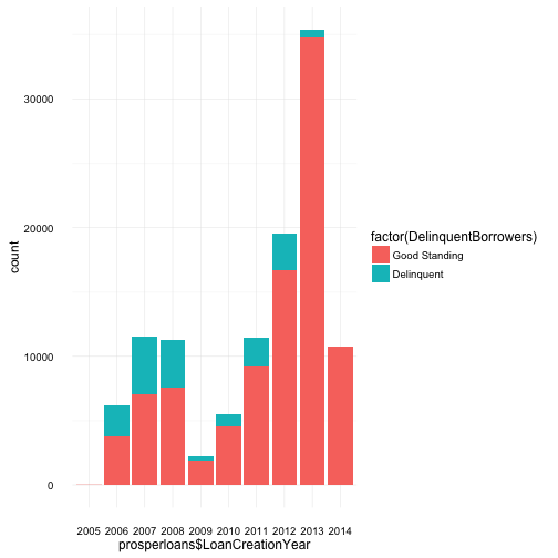
Inorder to help faciliate this more easily, I’ve decided to create a new variable which will capture the year segment of the loan creation date.
From first glance, there is an obvious dip in borrowers, both delinquent and otherwise across 2008 and 2009. My first thoughts were connecting this fall in borrowers to the finanical crisis which occurred in late 2008. However, remember, this is loan “creation” date, and on a side note, is a good lesson in understanding the data and miss-communication in visuals.
This data is not representing delinquent loans of 2008-9 but loans which went delinquent at some point in time that were created in 2007/8. I believe it can be assumed this is a lead up to the financial crisis, i.e. borrowers took out loans at a “normal” rate from 2006-2008 but potentially after the financial crisis in 2008, borrowers could no longer cover their monthly payments and loans created 2006-2008 were the most succeptable to defaults.
This assumption also explains the dip in 2009 and gradual increase over the next few subsequent years, less borrowers and much fewer delinquents in comparison to the level of loans in good standing.
However, after finalizing the polt and reviewing both good standing and delinquent borrowers it seems that during these years there was no overwhelming number of delinquent borrowers. It appears total borrowers (and/or investors) lowered during this time which may or may not be contributed to the financial crisis.
Time to further the analysis and investigate some other interesting features. Leaning towards investigating the relationship of borrowers and delinquency, I will do a deeper dive into: Term, LoanStatus, LoanOriginalAmount, Income Range, Borrower’s State and Listing Category (the reason for a loan).
Term and Loan Status
   Min. 1st Qu.  Median    Mean 3rd Qu.    Max.
  12.00   36.00   36.00   40.83   36.00   60.00
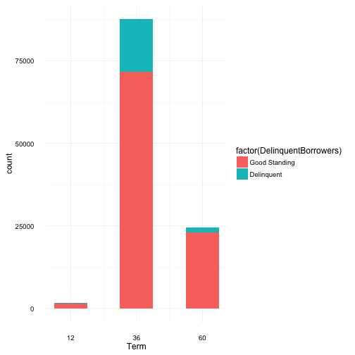
From the summary breakdown, the average term appears to be 36 months (3 yrs) with an original loan request being $8337, ranging from $1000 to $35,000. This seems to cover the full available range allowed by Prosper, although at the time of writting this analysis, Prosper now has a minimum loan limit of $2000. And what seems like a surprising amount, on average loans have 80 investors.
It’s also very clear that the majority of borrowers choose a 36 month term, where 60 and then 12 month terms are 2nd and 3rd most popular, respectively. And approximately 15% of the total borrowers are delinquent on their loans. Thinking of the distribution of delinquency arcoss terms, one would imagine larger term equates to a larger loan amount and monthly payments which may be too much to handle for some. This inturn would contribute to having more delinquncies. However, the distribution of delinquency is surprisingly very similar to that of the total loan distribution across loan terms. An investigation around loan amounts and across terms may reveal more, i.e if loans with larger amounts are associated to the borrowers with better credit scores, it’s more likely that these loans will be paid off and borrowers will be in good standing.
Original Loan Amount
   Min. 1st Qu.  Median    Mean 3rd Qu.    Max.
   1000    4000    6500    8337   12000   35000
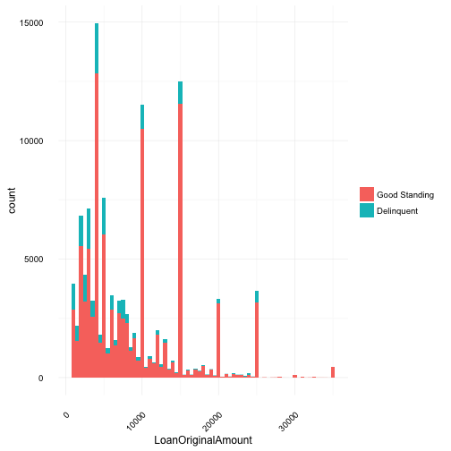
Summary data indicates mean and median quite far apart. This is visualized in the graph which is right skewed. As the spikes of borrowers at $10,000, $15,000 and $25,000 are pulling the mean higher. Although, it’s not particularly surprising that borrowers gravitate to these “nice” numbers.
# Get details with reduced binwidth and added breaks
g + geom_histogram(binwidth = 100) +
    scale_x_continuous(
      limits = c(500, quantile(prosperloans$LoanOriginalAmount, 0.95)),
      breaks = c(0, 2500, 5000, 7500, 10000, 12500, 15000, 17500, 20000))
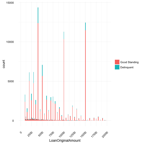
Taking a closer look at 95% of the data, specifically under $20,000, you can see multiple spikes at these “nice” numbers - 1000, 2000,…,8000, 9000, 10000 - dollars. Since most debt doesn’t come in nice round numbers, we can assume borrowers are probably rounding up instead to requesting exact dollar values for their loans. For example, if a borrower is $4,678.86 dollars in debt, she is probably requesting a loan of $5,000.00. From the data provided, I don’t believe there is in specific way to determine if this assumption is true, however, given that debt / money is a floating value with interest rate applied as floating value, it is quite unlikely that the majority of borrowers have debt divisible by 5.
Income Range
# Plot out income range of all borrowers
positions <- c("Not employed", "$0", "Not displayed",
                "$1-24,999", "$25,000-49,999", "$50,000-74,999",
                "$75,000-99,999", "$100,000+")

ggplot(prosperloans, aes(IncomeRange)) +
  scale_x_discrete(limits = positions) +
  theme_minimal() +
  theme(axis.text.x = element_text(angle = 45, hjust = 1)) +
  geom_bar()
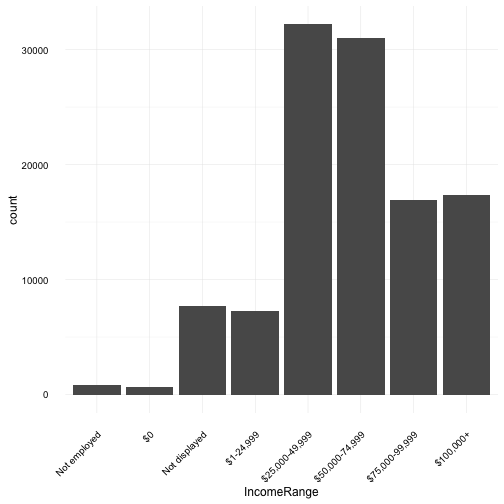
Reviewing income range allows us to see the distribution of total borrowers and their income with a $25k dollar bin / range. This could shine light into the fincanical standing of borrowers which may be contributing factors to delinqunency.
The distribution of borrowers across income range is somewhat normal if we consider that there are a number of users in the “Not Displayed” category, which was re-odered with the assumption that this category of borrowers do indeed have an income. Of note, it is quite unexpected to see any, let alone such a large number of borrowers with stated incomes of over $100,000.
Borrowers State
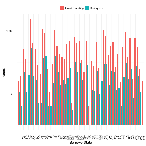
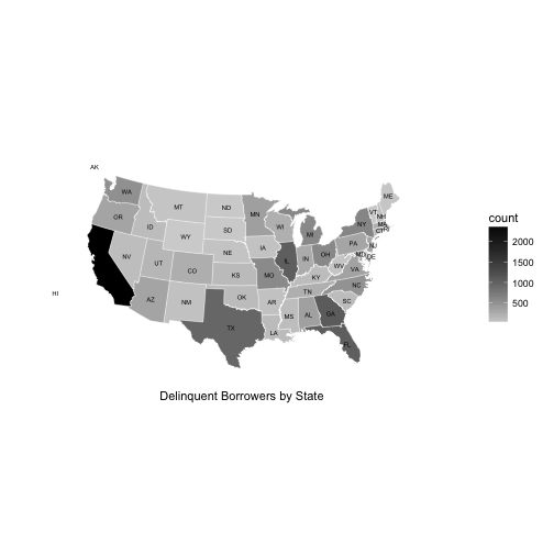
Borrowers state covers 52 states, this includes Alaska and Hawaii. Representation for California is skewing the graph, unable to distinguish smaller state counts and differences among states. Given California is the most populous state in the US, having a much higher count in borrowers is probably not a good indicator of a trend. To fix this and to better view any potential trends, a log10 transformation was applied to the y axis.
California has the highest count of delinquents but it should be taken into consideration that this state is also the more populous. While Florida, Texas and the East coast follow suite. Noticably, “middle America” has the lowest levels of delinquent borrowers but this could also be due to lower levels in population, technical savvy, lower cost of living resulting in better financial situations not requiring loans, etc or a host of other reasons outside of the information the dataset provides.
Two other unexpected results from the plot shows 1) there are no states with more delinquent borrowers than those in good standing and 2) the states of ND and WY have negliable numbers of delinquent borrowers.
Listing Category
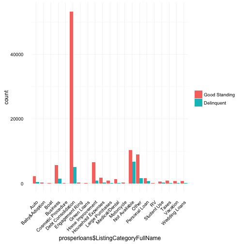
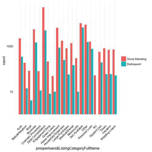
The listing category values represent the purpose or reason why the borrower is requesting a loan. For example, if the value is “Auto”, perhaps the borrower recently purchased an expensive car and needs $10,000 as a downpayment to lower her monthly bill.
Based on the above plot, although “Debt Consolidation” is by far the most common reason borrowers require a loan, this is misleading. Debt consolidation removes the specificity of where the debt came from, i.e. Auto, Student Use, Taxes could have equally contributed to someone’s debt but the “reason” the borrower is requesting a loan is for consolidation and therefore they flag “Debt Consolidation” as the purpose. One thing we can take away from the high volume of borrowers requesting debt consolidation loans, is that, many borrowers have debt from multiple sources.
Bivariate analysis
Continuing to look for trends in delinquencies, I will investigate possible expected and unexpected relationships between features with tools such as the scatterplot and boxplot.
Listing Cateogry and Loan Amount
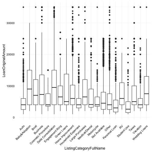
In the above two plots, I examine the loan category, loan amounts and borrowing rate. Debt consolidation as expected has the highest loan amounts across categories; however, unexpectedly “Baby and Adoption” category is also the highest (tied) loan amount across categories. It would be interesting to investigate the total number of borrowers across these two categories, one would expect debt consolidation to have a large distribution of borrowers.
Also of note, the “Student Use” category loan amount it quite low. Given the well documented high levels of student debt, we can assume students didn’t suddenly stop having debt but instead don’t use Prosper to manage their debt or this category covers items other than student tutition such as lunches, dinners and books.
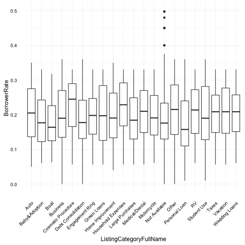
The borrower’s interest rate doesn’t seem to have any particular surprises. The mean borrowing rate across all categories tend to vary between 0.15 and 0.25.
Loan Term and Loan Amount
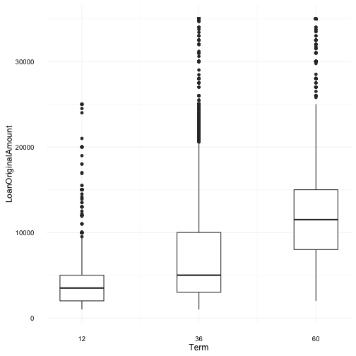
In this plot, I examin the three (3) term loans and borrower’s loan amounts. Surprisingly the 60 month term has a mean value much higher than that of the 36 month term loan. This considering our previous plot where only approx. 25k borrowers used 60 month term loans in comparison to approx. 75k borrowers who used 36 month terms. This could be a point of further investigation particularly around delinquent accounts i.e. what percentage of 60 month terms go into delinquency in comparison to the other 2 term loan periods?
Loan and Bankcard Utilization
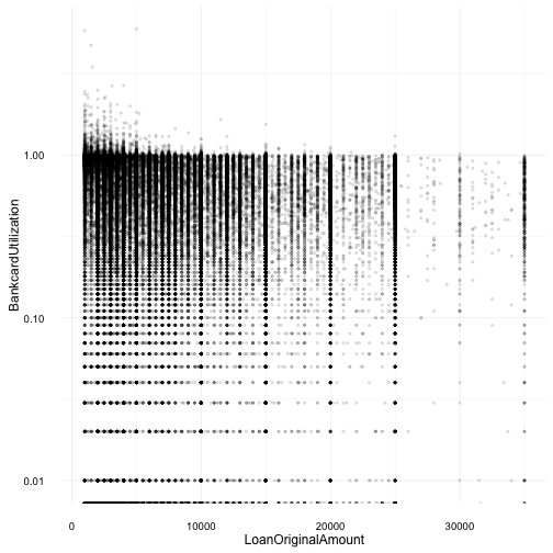
This plot was quite disappointly surprising as I was expecting a different/stronger relationship where loan amounts would rise as bankcard utilization lowered. Instead, we see a high volume cluster of loans under $10,000 with borrowers close to 100% bankcard utilization. I may revisit both of these variables, in a different light, later in the analysis but I would consider this correlation/trend/relationship discovery between these two variables a dead end.
Debt-to-Income Ratio
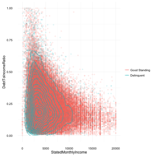
In comparing debt-to-income ratio with a borrower’s stated monthly income I was expecting to see a somewhat obvious, trend that delinquent borrowers would have a lower monthly income and a higher debt-to-income ratio. With overplotting in the scatterplot two additional techniques were used to more clearly reveal any trends or unexpected results.
Borrwers with stated incomes over $20k and debt-to-income ratios over 1 were considered as outliers and removed from the plot.
The density contour lines show a high concentration of delinquent borrowers earn less than $2500 a month but have a low debt-to-income ratio of under 0.50 (or 50%). The plot also suggests a negative correlation between monthly income and debt-to-income ratio, i.e the more a borrower makes in monthly income the lower their debt-to-income ratio; However, this does not guarantee the loan will not go into delinquency.
After further review from multiple online resources, it seems that a typical “good” debt-to-income ratio is under approx. 36%.
Interest Rate and Debt-to-Income Ratio
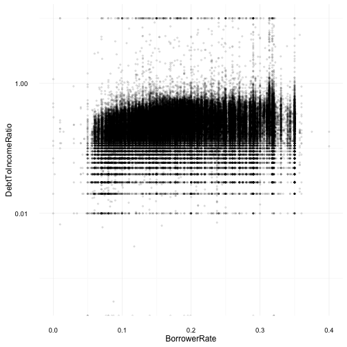
The relationship between a borrower’s interest rate (BorrowerRate) and their debt ratio (DebtToIncomeRatio) was expected to be a positive correlation. I expected borrowers with high debt-to-income ratios would automatically receive higher interest rates on their loans. However, based on the above scatterplot, there seems to be no trend and a weak positive correlation between these two variables. Further investigation when plotting a correlation matrix will expose the details.
Multivariate Analysis
In this section, I’ll dive into examining the relationships between multiple variables of the dataset. There are some expected “strong” relationships which will be investigated but also any unusual or unexpected relationships, strong or weak, will also be called out for a deep dive into the details.
First, a correlation matrix will be used to calculated the coefficients in order to help start the investigation process where by the variables with strong and/or weak relationships will be reviewed.
Correlation Matrix
# Pearson correlation coefficients, using pairwise observations (default method)
# Non-numeric columns automatically removed/ignored
ggcorr(prosperloans, label = TRUE, label_size = 3,
       hjust = 0.8, size = 2.5, color = "black", layout.exp = 2)
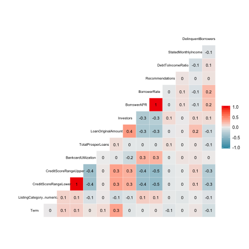
The correlation matrix revealed a few surprising things - I thought there would be a much stronger relationship between interest rate (BorrowerRate) and the credit score (CreditScoreRangeUpper/Lower). At a score of -0.5 it’s the strongest correlation out of the selected variables. Also, the number of investors (Investors) and the borrower loan amount (LoanOriginalAmount) has a positive correlation of 0.4, which was somewhat expected as investors are only allowed to contribute a portion of a loan amount, i.e. no one investor can lend an entire loan amount.
Below, a few particularly interesting relationships will be investigated further.
Credit Score and Borrowing Rate
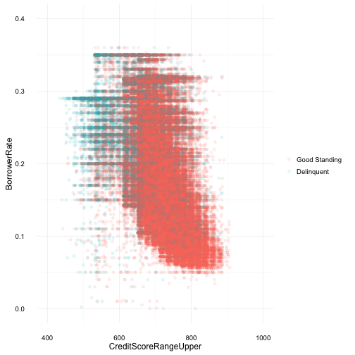
We see an expected result here, where the trend is lower credit scores tend to have higher borrowing rates and higher credit scores obtaining a lower borrowing rate. Delinquent borrowers also tend to have lower credit scores, this could be in part due to their higher interest rates on loans hendering payments and causing delinquencies. If lower credit scores mean higher borrowing rates, and higher rates tend to cause delinquency, how does anyone with a low credit score get out of the cycle? What’s the cause and effect? More investigation would be required to come to a conclusion. And also as expected, borrowers with higher credit scores and lower interest rate, tend to be in good standing with their loans.
Credit Score and Loan Amount
Summary: Delinquent Borrowers
   Min. 1st Qu.  Median    Mean 3rd Qu.    Max.    NA's
   19.0   619.0   679.0   661.5   719.0   879.0     174
Summary: Good Standing
   Min. 1st Qu.  Median    Mean 3rd Qu.    Max.    NA's
   19.0   679.0   719.0   712.4   739.0   899.0     417
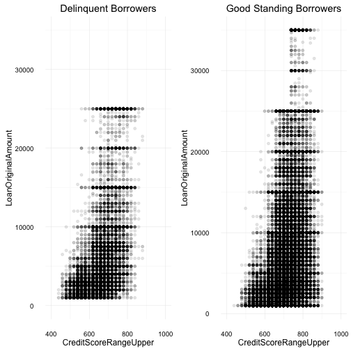
In the above comparisons, both scatterplots show a borrower’s credit score against their loan amounts. Once again, this plot reveals some expected and unexpected results.
The higher concentration of delinquent borrowers have lower credit scores, and they also tend to borrow less money, under $10,000. This maybe due to our previous plot which indicates, lower credit scores often tend to have higher interest rates on their loans - this was an expected result. What was a bit unexpected was the lower loan amount for borrowers with much higher credit scores. Based on previous plots, higher scores provide lower rates, which would tend to allow the borrower to gain access to a higher loan amount. And although the average loan amount for loans in good standing are higher, there is still a high concentration of loans under $20,000 and with credit scores over 700. One other “weird” result which I’ve ignored so far has to do with the credit score values, for example, some borrowers have score of 899 where credit scores range only between 300 and 850.
Loan Amount and Investors
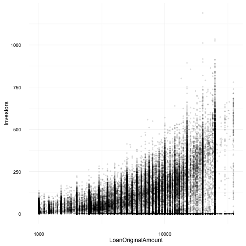
Based on the correlation matrix, a positive relationship was expected. However, the non-linear, somewhat expotential curve of investors to loan amount was unexpected. This plot also shows a wide variance from the centred curve line of the corelation. Of note, Proper doesn’t allow investors to contribute more than 10% of their net worth to any one loan. This could be the underlying factor contributing to the positive correlation between loan amount and number of investors.
Bankcard Utilization and Borrowing Rate
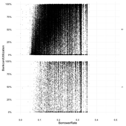
Revisiting bankcard utilization, this time with borrowing rate, it was unexpected to see bankcard utilization over 1 or 100% and how the typical calculation happens doesn’t seem to allow a utilization of over 100%. Another unexpected result, was the large number of borrowers with high bankcard utilization who were in good standing. And although there are a larger number of borrowers in good standing, in comparison to delinquent borrowers, good standing borrowers have a utilization which is more evenly spread through 0 to 100%.
Loan Amount and Year across Income Range
[1] "$0"             "$1-24,999"      "$100,000+"
[4] "$25,000-49,999" "$50,000-74,999" "$75,000-99,999"
[7] "Not displayed"  "Not employed"
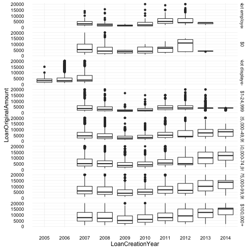
These were quite interesting plots, as all income ranges display the same curve (distribution across 2007 - 2014). Again, this could be a result of loans, investors and the financial crisis as mentioned previously. Also, the cateogry “not displayed” is missing data after 2008, and one can assume that possibly this category was removed as an option for users after 2008, forcing users to provide more transparency - which also could have been a side effect of the crisis. However, only in 2007 is there data for any of the other categories, which would imply that during 2005 and 2006, none of the income range categories existed (or the data was lost/not recorded).
Also of note, borrowers with $100,000+ consistently have a wider spread of loan amounts over the years. And borrowers within the categories of “$0” and “not employed” should probably be lumped together to provide more accurate information or at least, more manageable information - since by definition, you cannot be employed with $0 income but you can be, not employed, and still have income (e.g. retirees).
On a deeper dive of the same plot, loan amount by year across income range, I investigate any possible trends around delinquency and spot some unexpected results. Particularly with borrowers whose income range is over $100,000. Delinquency for this income range tends to tread higher then good standing accounts, especially with loans created prior to 2008. These delinquent loans tend to have a higher min, max and mean dollar amount. This larger delinquency gap can also be seen with borrowers of the $0 income range.
Final Plots and Summary
Plot 1
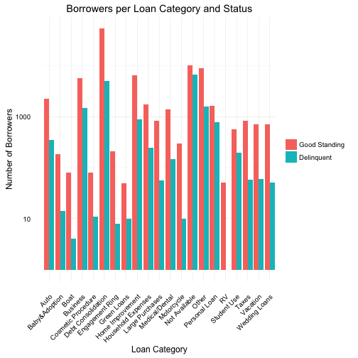
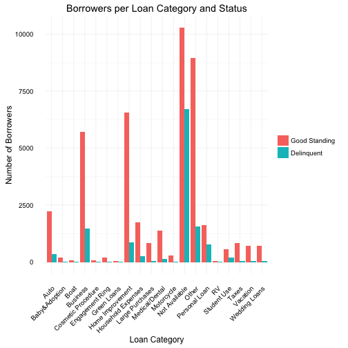
In the above plots we examine the different categories of loans (reason borrower’s need the loan) and the total number of borrowers for that type of loan.
The initial plot showed “debt consolidation” as an extreme outlier and therefore the a scale log10 of the y axis was required in order to better visualize and compare all categories.
The debt consolidation category is somewhat misleading as multiple categories could be lumped into one - which is exactly what it is by definition. However, I believe it doesn’t allow for enough details when using this variable for trend or relationship analysis and the category is probably better left ignored during those types of investigations. But one thing we can take away from the high volume of borrowers requesting debt consolidation loans, is that, many borrowers have debt from multiple sources and is by far the most frequent category.
When reviewing the plot under log10 y axis, the low delinquency of boat loans and the lack of any delinquent borrowers for RV loans was quite interesting although the actual number of borrwers is specially low with 52 and 85, respectively. To help clarify the comparison, a 2nd plot without the “debt consolidation” category or the log10 y scale transfrom was plotted. Here, we can see the best loan categories would be “Other”, “Home Improvement” or “Business” and not “boat” or even “RV”.
Plot 2
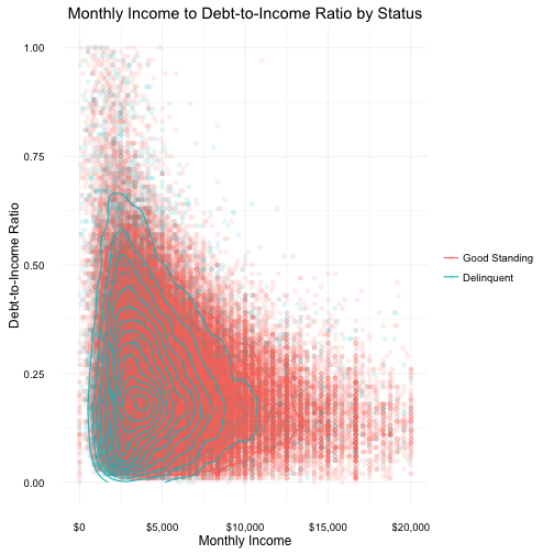
In the above plot we examine the stated monthly incomes of borrowers and their debt-to-income ratio. This data was then visually categorized by delinquent and good standing loans.
To mitigate overplotting, density contour and other layers were applied to the plot. These techniques help to reveal trends and unexpected results.
The density contour lines show a high concentration of delinquent borrowers earn less than $2500 a month but have a relatively low debt-to-income ratio of under 0.50 (or 50%). The plot also suggests a negative correlation between monthly income and debt-to-income ratio, i.e the more a borrower makes in monthly income the lower their debt-to-income ratio; However, this does not guarantee the borrower will not go into delinquency.
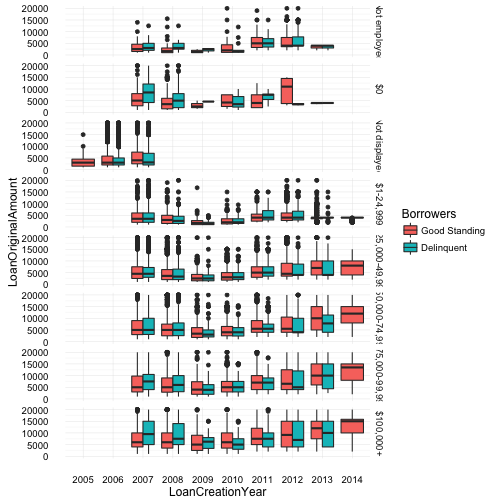
Plot 3
Income Range:
[1] "Not employed"   "$0"             "Not displayed"
[4] "$1-24,999"      "$25,000-49,999" "$50,000-74,999"
[7] "$75,000-99,999" "$100,000+"
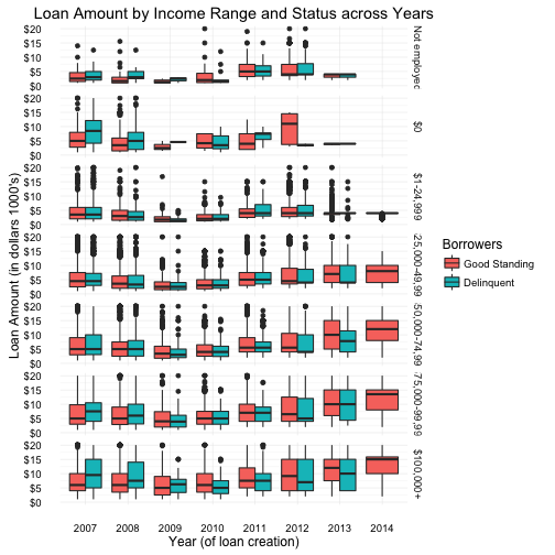
In the above plot we examine the borrower loan amount by their income range across loan creation year. The data was then separated and visualized by borrowers in good standing and delinquent.
Category data for “Not Displayed” was removed from the plot. This particular category is missing all data after 2008, and one can assume this category was removed as an option for users after that date, forcing users to provide more transparency. And only in 2007 is there data for any of the other categories, which would imply that during 2005 and 2006, none of the income range categories existed (or the data was lost/not recorded). With this knowledge, I believe ignoring the “Not Displayed” category data would not adversely affect any analysis.
Overall, the plot reveals and confirms some trends by providing a different perspective on the data, such as the distribution across years which “slumps” into a valley type curve in years 2008, 2009 and 2010. This happens across all income ranges and borrowers with good standing and delinquent loans. There were also strange unexpected results specifically, with borrowers whose income range is over $100,000. Delinquency for these borrowers tend to tread higher then good standing accounts, especially with loans created prior to 2008. These delinquent loans also have a higher min, max and mean values. This larger delinquency gap can also be seen with borrowers of the $0 income range, although I’m not sure of any possible connection.
Also of note, borrowers with $100,000+ consistently have a wider spread of loan amounts over the years. And clarification should be made around the “$0” category. A borrower can indeed have money with any income but how would she pay back the loan? The “Not Employed” category, although questionable could be a legitimate category since by definition, you cannot be employed with $0 income but you can be, not employed, and still have income (e.g. retirees).
Reflection
The prospser loans dataset contains over 100k observations with 81 variables spanning across 9 years. Understanding the variables, terminology and general domain knowledge of financial peer-to-peer lending was the first obstacle in approaching this dataset. However, the one ongoing hurdle was dertermining which variables to analyze, not drifting too far off any one path of investigation and not pulling in new variables throughout the process. Another persistent issue was overplotting on scatterplots, a number of techniques were used across multiple plots but I was still not very happy with the results.
However, success was found in many areas. The general analysis revealed areas of interests such as positive corelation between credit score and borrowing rate which brough up any curious questions concerning delinquent borrowers and the perplexity of cause and effect. Also, trends were confirmed and unexpected, unknown relationships such as those between loan amount and the number of investors contributing to that loan, were revealed.
I also categorize success as to areas that were discovered which need to be further investigated. I believe additional time in multivariate analysis on variables such as occupation, income range, loan category and delinquencies would expose more trends and perhaps allow for predictions among borrowers (those who will or will not go into delinquency). Also, having only analysed 20 of the original 81 variables leaves a lot of undiscovered relationships/correlations and trends.
Additional data would also enhance this dataset. Having the borrower’s age and sex would allow analysis to possibly discover trends among men and women or young and old. Also, population and state-average-income features, would allow for discovery of the type of environment the borrower lived in. For example, a borrower at $75,000 income living in California could be considered middle class within that State. This is in comparison to a borrower from Texas in the same income range bracket which might be consider in the upper class - Does your class (lower, middle or upper) help determine if you use and/or become a delinquent borrower? This would be dependent on the borrower’s state and the state’s average income range. These types of questions and more could be answered with additional data.
References
- https://en.wikipedia.org/wiki/Charge-off
- https://en.wikipedia.org/wiki/Default_(finance)
- https://www.prosper.com/help/topics/how-to-read-a-loan-listing
- http://www.investopedia.com/terms/c/credit-utilization-rate.asp
- http://www.investopedia.com/terms/d/delinquent.asp
- http://docs.ggplot2.org
- http://zevross.com/blog/2014/08/04/beautiful-plotting-in-r-a-ggplot2-cheatsheet-3
- https://en.wikipedia.org/wiki/List_of_states_and_territories_of_the_United_States
- http://stackoverflow.com/a/29618201/1343001
- http://www.investopedia.com/ask/answers/100314/what-difference-between-interest-rate-and-annual-percentage-rate-apr.asp
- https://briatte.github.io/ggcorr
Programming Environment
sessionInfo()
R version 3.3.0 (2016-05-03)
Platform: x86_64-apple-darwin13.4.0 (64-bit)
Running under: OS X 10.11.4 (El Capitan)

locale:
[1] en_CA.UTF-8/en_CA.UTF-8/en_CA.UTF-8/C/en_CA.UTF-8/en_CA.UTF-8

attached base packages:
[1] methods   stats     graphics  grDevices utils     datasets
[7] base

other attached packages:
[1] GGally_1.0.1    gridExtra_2.2.1 mapproj_1.2-4   maps_3.1.0
[5] dplyr_0.4.3     ggplot2_2.1.0   yaml_2.1.13     knitr_1.13

loaded via a namespace (and not attached):
 [1] Rcpp_0.12.4      magrittr_1.5     MASS_7.3-45
 [4] munsell_0.4.3    colorspace_1.2-6 R6_2.1.2
 [7] stringr_1.0.0    plyr_1.8.3       tools_3.3.0
[10] parallel_3.3.0   grid_3.3.0       gtable_0.2.0
[13] DBI_0.4-1        lazyeval_0.1.10  digest_0.6.9
[16] assertthat_0.1   reshape2_1.4.1   formatR_1.3
[19] codetools_0.2-14 evaluate_0.9     labeling_0.3
[22] stringi_1.0-1    scales_0.4.0     reshape_0.8.5